Layout Composition
There are multiple ways to enable layouting in complex apps. Thinking off the top of our heads, there are a few that come to mind.
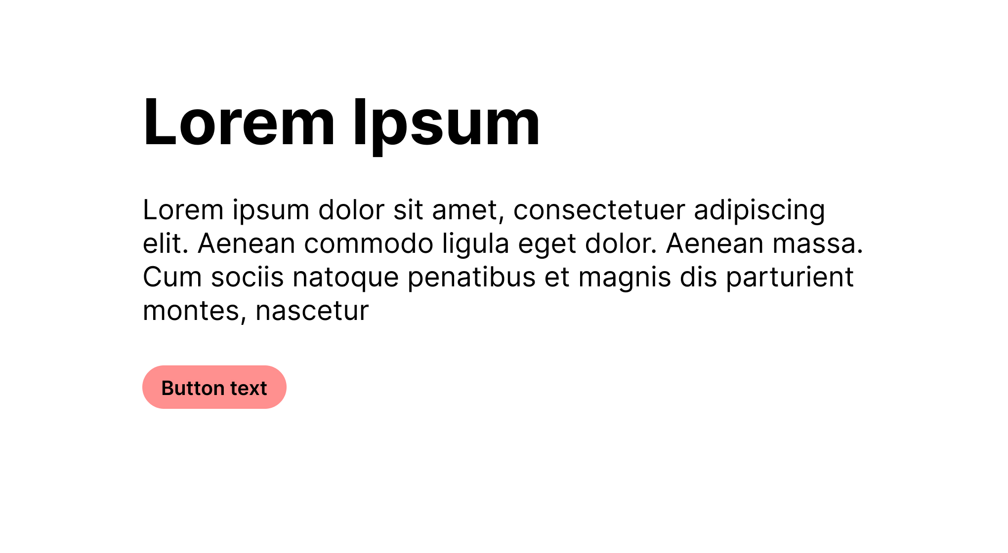
Let's think of our example with the buttons again.
Say we have a layout that includes a headline, a subline and a button, but we also want some margins between them so they don't stick to each other.
The "wrong" way
One approach would be to, since we're building a component library, just include the margins in all the components like so, where the red border indicates the component and the light red it's margins.
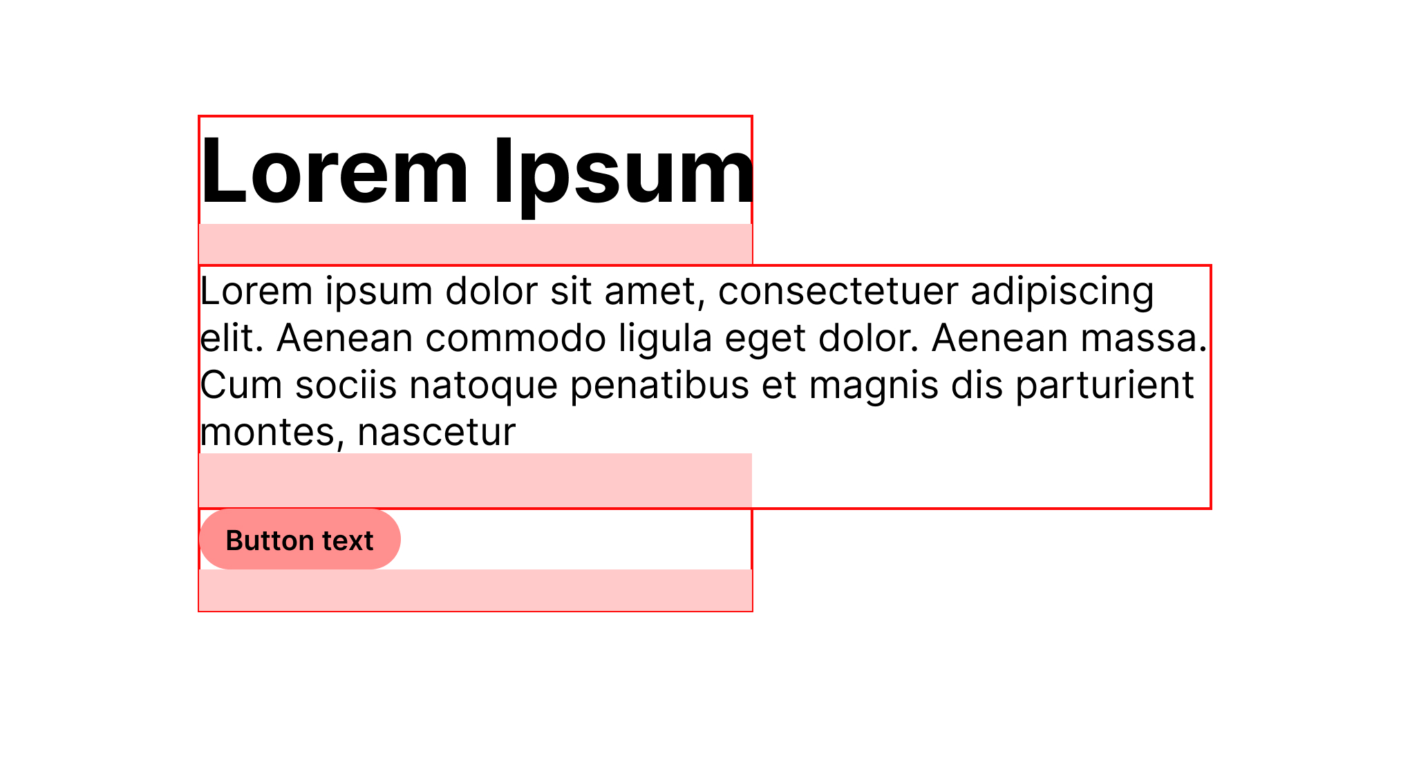
This will leave us with some clean markup, which might seem great.
<Container>
  <Headline>Lorem ipsum</Headline>
  <Subline>
    Lorem ipsum dolor sit amet, consectetuer adipiscing elit. Aenean commodo
    ligula eget dolor. Aenean massa. Cum sociis natoque penatibus et magnis dis
    parturient montes, nascetur
  </Subline>
  <Button>Button text</Button>
</Container>
This might work fine for a while, but what happens if we want to add someting that sticks directly to the button? What if we want to wrap the button in a component that brings it's own padding in the bottom? All of these use-cases would now be moot without a meaningful way to override the bottom-margin of the button. But then, why are we baking the margin into the button if we'll have to override it again in a significant amount of use-cases?
Well, in comes layout composition.
Using layout composition
The idea behind layout composition is that components don't care about the layout that they're being used in.
Being atoms, there's no reason to add any outer margins or component stylings to them, since this would just complicate using the components in other use-cases which we might not have thought about earlier.
For this, we have Layout components.
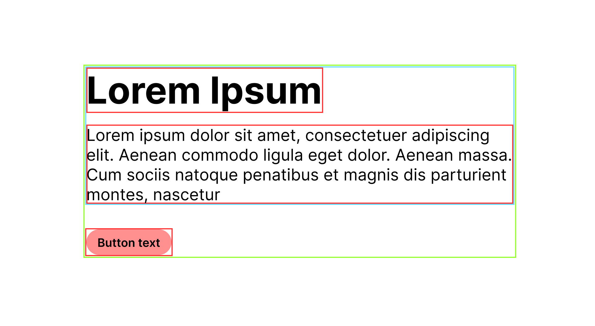
In this case, the Stack component would be a good fit.
Using this, we get the following markup.
<Container>
  <Stack spacing={25}>
    <Stack spacing={15}>
      <Headline>Lorem ipsum</Headline>
      <Subline>
        Lorem ipsum dolor sit amet, consectetuer adipiscing elit. Aenean commodo
        ligula eget dolor. Aenean massa. Cum sociis natoque penatibus et magnis
        dis parturient montes, nascetur
      </Subline>
    </Stack>
    <Button>Button text</Button>
  </Stack>
</Container>
While this makes us use a bit more markup, we now have a declarative way in our application to define margins and layouts, which means it makes all of our atoms a lot more versatile while also making it a lot easier to understand where and how margins are defined in our final application (that's the one you're building),
This also brings us a lot closer to how Figmas Autolayout works.
All of this will give us the following result, where we have our atoms defined in red, and our stacks defined as blue and green respectively.
Want to learn more about Layout composition? Check out the Bedrock Primitives Documentation.